OSPUNK
Active member
- Nov 21, 2018
- 167
- -39
- 35

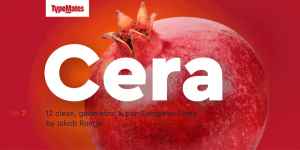
The pan-European Cera Collection is driven by pure geometry and contains the bestselling Cera, its stenciled counterpart Cera Stencil, Cera Condensed, the hand-crafted display Cera Brush and the soft Cera Round.
The starting point for the collection, Cera Pro is distilled from elementary shapes and brings simplicity, elegance and a certain warmth wherever a contemporary geometric typeface is needed.
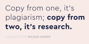
Cera Pro’s six weights, thin to black, give it a full range of expression for interfaces and corporate design; in print, on screen and in multiple languages. Matching italics, carefully sloped a lively 10º, are invigorated with a dash of rotalic flavour: keeping the o a perfect circle and giving Cera Pro’s italics striking effect when used for display typography.
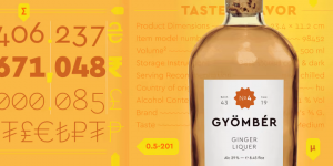
A steadfast companion for text, Cera Pro has a large x-height and compact capitals. For best on-screen performance the TrueType files for the web and desktop fonts have been improved with manual hinting. Naturally, it also has all the useful dingbats and arrows you might need.


The extended, pan-European Cera Pro supports around 150 languages in the Latin, Cyrillic and Greek scripts, and its non-Latin components were developed with native consultants. With over 980 glyphs per style, Cera cares about localised letterforms and has the OpenType features to match.
Designers: Jakob Runge
Publisher: TypeMates
MyFonts debut: Nov 13, 2015
Download

