[Help] Creating a Row Separator with Text in Wp-Bakery

patrocle

Well Known Senior Member!
Trusted Uploader
Nov 17, 2018
966
1,571
100
Ca. Usa
babiato.tech
So guys i need some help... as after i spent some time trying to figure this out i give up...

So here is the dilemma. I am trying to add a row separator with text in ListingPro wordpress theme on main home page, like this one here:

2021-04-10_9-25-14.jpg

U can see it live here: www.koelner-adressen.de u can click for English to translate

I use wp-bakery .

Any help will appreciate !
 

MrSam_1

Well-known member
Administrative
Trusted Seller
Dec 1, 2018
23,637
26,969
120
I don't really know WPBakery but it should be something like a text or heading element with the row given a background colour. That's how I'd do it in Elementor so would imagine something similar in WPB.
 
  • Like
Reactions: patrocle

patrocle

Well Known Senior Member!
Trusted Uploader
Nov 17, 2018
966
1,571
100
Ca. Usa
babiato.tech
Ya i try all the combinations, at one point i got the banner and color ,but there was no option to add the text.
Problem is with ListingPro that when i started to create the site i started with both with wp-bakery and elementor but for some reason the main page is with wp-bakery and if i want to open with elementor it gives me an error and does not open. To late not to convert to elementor Hmmm... Plus not much experience with elementor.
But thanks! for posting.
 

MrSam_1

Well-known member
Administrative
Trusted Seller
Dec 1, 2018
23,637
26,969
120
Ok it looks like you need to use a "Styled TextBox" where you set the background colour and then put a "Text Block" inside that to actually put your text.

Wow WPB sucks 😂
 
  • Like
Reactions: patrocle

patrocle

Well Known Senior Member!
Trusted Uploader
Nov 17, 2018
966
1,571
100
Ca. Usa
babiato.tech
I not really a pro in this, but looks that i manage to figure out a little ;)
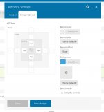
I used a text block, and edited the wording. Now i like it how it came out. The only problem is i need to move the text up a little to in the middle.

Got code:
<h1 style="color: black;"><strong>Facebook Groups</strong></h1>


2021-04-10_11-24-38.jpg

2021-04-10_11-24-11.jpg
 

frizzel

Well-known member
Trusted Uploader
Jun 13, 2019
485
253
63
Wherever my imagination takes me
With paddings all equal, the text should be in the middle. In your screenshot, the padding-top is smaller, so it should be higher, however it renders below the middle. I'm guessing there's some other CSS conflicting, most probably the CSS for the H1 tag.

And yes, I agree with @Medw1311 WP Bakery sucks big time, try to avoid it.
 

MrSam_1

Well-known member
Administrative
Trusted Seller
Dec 1, 2018
23,637
26,969
120
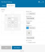
I can't figure out how to change the font in the editor but here's what I've got....

Capture.JPG

Capture2.JPG

In the first picture make sure you have no stray &nbsp; in there.
 
  • Like
Reactions: patrocle

patrocle

Well Known Senior Member!
Trusted Uploader
Nov 17, 2018
966
1,571
100
Ca. Usa
babiato.tech
Hmm thanks, did not work on my end , got the same layout not in the middle
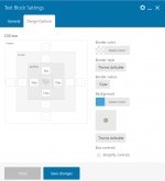
but i manage to fix it, the css was the problem , top 5px and the sides at 10 px and the lower at 15 px. 2021-04-11_19-21-34.jpg

2021-04-11_19-22-20.jpg
 
  • Like
Reactions: MrSam_1

frizzel

Well-known member
Trusted Uploader
Jun 13, 2019
485
253
63
Wherever my imagination takes me
but i manage to fix it, the css was the problem , top 5px and the sides at 10 px and the lower at 15 px.
No, you did not fix it. With those padding settings, the title should not be in the middle, and besides in your screenshot it is not exactly in the middle. So, I still think there's another css declaration overruling what you are doing in the text editor.
 
  • Like
Reactions: patrocle

About us

  • Our community has been around for many years and pride ourselves on offering unbiased, critical discussion among people of all different backgrounds. We are working every day to make sure our community is one of the best.

Quick Navigation

User Menu