- Mar 3, 2019
- 227
- 249
- 43
I think it will be more helpful to others when they have the same problem as me in the future and can search through the thread on babiato.tech
So I will write here according to the title and question.
I previously wrote here, in my other question to ask and got help with my problem. Thank you @Knights for your help.
I changed the product carousel display with some css code for mobile display.
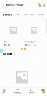
Generally, on the mobile display it will show 2 products per line (before : https://snipboard.io/zYW1nS.jpg).
And I want to be 1 product + next partial product per line, like here I’m displaying it for mobile display.(after add some css : https://snipboard.io/ecKVzg.jpg)
Normally, when a product is swiped, it will display the next product.
However, I’m having a problem, when the next product doesn’t display properly ( eg: when the carousel starts on product 1, it shifts to product 3 and so on.)
Please see the link below for the screen recording for more details.
(https://we.tl/t-qTjjdXwyRX) or you can see live here (Use Mobile Layout view to check this on desktop – https://bit.ly/3O7l2c)
This is the css code I added
Thank you in advance.
Really appreciate anyone’s help.
So I will write here according to the title and question.
I previously wrote here, in my other question to ask and got help with my problem. Thank you @Knights
I changed the product carousel display with some css code for mobile display.
Generally, on the mobile display it will show 2 products per line (before : https://snipboard.io/zYW1nS.jpg).
And I want to be 1 product + next partial product per line, like here I’m displaying it for mobile display.(after add some css : https://snipboard.io/ecKVzg.jpg)
Normally, when a product is swiped, it will display the next product.
However, I’m having a problem, when the next product doesn’t display properly ( eg: when the carousel starts on product 1, it shifts to product 3 and so on.)
Please see the link below for the screen recording for more details.
(https://we.tl/t-qTjjdXwyRX) or you can see live here (Use Mobile Layout view to check this on desktop – https://bit.ly/3O7l2c)
This is the css code I added
@media only screen and (max-width: 400px) {
.woocommerce ul.products {
margin-left: -10px;
margin-right: -80%;
}
@media only screen and (max-width: 400px) {
.woocommerce ul.products:not(.slick-slider) {
display: list-item;
flex-wrap: wrap;
overflow: scroll;
}
Thank you in advance.
Really appreciate anyone’s help.
Last edited:


