Hi counselme,
your site looks amazing! You put in so much work and it looks so professional. I like your animations.
I did not log in (as I don't want to crash things), but I saw a few things you might want to consider:
- Sponsors/Students/Scholarships "banners" on the main page are weirdly blending out for a slight millisecond when I hover them the first time.
- 4127+ STUDENTS needs more spacing/padding from the left.
- When you present the "Latest Scholarships" and hover the scholars picture you see the text on the picture and the text element (the headline) above it. It looks a bit crazy to have the text layered. Maybe opt for a picture without text.
- Is there a CBO Capital Sensor picture without the white background but instead with transparent? This would match better with the others. Same for AdelaRandle and SweetSensation.
- In the footer, there is just the headline "Newsletter". That's it. Nothing below to type in my email address or something. No text just a headline without more information.
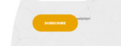
- There is something I cannot see correctly because of layering (see attached screenshot).
All in all, you can be really proud of this design.
Best, Kaeferliebe