Review: www.tedioli.com
- Thread starter Naima88
- Start date
-
Welcome to Original Babiato! All Resource are Free and No downloading Limit.. Join Our Official Telegram Channel For updates Bypass All the resource restrictions/Password/Key? Read here! Read Before submitting Resource Read here! Support Our Work By Donating Click here!
You are using an out of date browser. It may not display this or other websites correctly.
You should upgrade or use an alternative browser.
You should upgrade or use an alternative browser.
Post an introduction thread before creating site review.
Thanks Web3.0 for your suggestion.
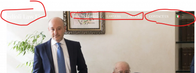
I understand what you are saying, but the slider is made up of 4 pictures, with backgrounds of different colors (light and dark).
If I do the thing that you advise me, then, in the dark images the menu will be too dark.
At least, that's what I've experienced in the past.
You can darken a bit the top of the lightest images of your slider, so the text will be easier to read
thanksYou can darken a bit the top of the lightest images of your slider, so the text will be easier to read
kaeferliebe
New member
Hi Naima88,
regarding the above mentioned background-font-contrast issue: you can also set a background color for the navigation that unifies the contrast to the font. Layered above the background. Probably in the same color as the footer!
I also love the logo font on one of your slider pictures. Have you thought of putting it over all slider pictures as a font and not in the picture? Then it would be more present Or the logo from the footer with the big "T". Or the animation from the contact site - love it!
Also I think your website is fast, which is probably also because you scaled down your pictures. I think some of them are slightly too pixel-y.
When you hover over the instagram logo above the footer, there is a weird white border (?) appearing that cuts the instagram logo on the left side - only a bit, but still you can see it.
Good luck!
Best,
Kaeferliebe
regarding the above mentioned background-font-contrast issue: you can also set a background color for the navigation that unifies the contrast to the font. Layered above the background. Probably in the same color as the footer!
I also love the logo font on one of your slider pictures. Have you thought of putting it over all slider pictures as a font and not in the picture? Then it would be more present
Also I think your website is fast, which is probably also because you scaled down your pictures. I think some of them are slightly too pixel-y.
When you hover over the instagram logo above the footer, there is a weird white border (?) appearing that cuts the instagram logo on the left side - only a bit, but still you can see it.
Good luck!
Best,
Kaeferliebe
Similar threads
- Replies
- 0
- Views
- 519
- Replies
- 1
- Views
- 827
- Replies
- 1
- Views
- 880


