OSPUNK
Active member
- Nov 21, 2018
- 167
- -39
- 35


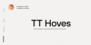
Unlike the first two typefaces included in the trilogy, TT Hoves has a distinct character, but without too bright bursts or kinks—it’s not too neutral and is moderately bright. We wanted to create a sans serif with recognizable patterns and geometry that would be perfectly suited for solving visual problems in such areas as architecture, design, industry, science, astronomy, drawing, high tech, research, space, statistics.
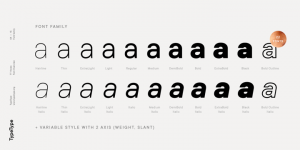
The typeface name TT Hoves comes from an abbreviated combination of two words: horizontals + verticals (ho + ve), which is intended to emphasize the fact that vertical and horizontal strokes predominate in the design of the typeface. Other distinctive features of the TT Hoves design are sharp turns in letters like f t J r j and the shape of the internal junctions of diagonal 2-point strokes (A W M N V X), which is intended to add a square and technologically advanced touch to the picture. The stroke thickness tends to a single width for the entire range of styles, with natural compensations in the boldest styles.
Designers: Ivan Gladkikh, TypeType Team, Pavel Emelyanov
Publisher: TypeType
MyFonts debut: Jun 11, 2019
Download

