OSPUNK
Active member
- Nov 21, 2018
- 167
- -39
- 35


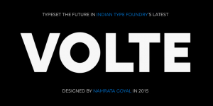
Graphic designers always search for new geometric sans faces appropriate for our times. ITF is pleased to present them with Volte. Including the five most essential font weights (Light–Bold), Volte Latin differentiates itself from the geometric sans pack through its simplification and reduction. For a geometric sans, Volte’s letters are very open. Some letters appear constructed, but they all retain the necessary geometric and monolinear spirit. Volte’s openness increases its legibility, too. Coupled with its clear style, this helps make Volte Latin an effective workhorse typeface.
Designers: Namrata Goyal
Publisher: Indian Type Foundry
MyFonts debut: Mar 20, 2015
Download

