Help - Betheme - Disable Responsive view on individual sections

katio

Active member
Babiato Lover
Jun 27, 2019
150
26
28
Hi,

I was wondering if there is any custom CSS that will disable the responsive view for one section within a page? I currently have three columns with link text within each ( like a menu) however when visible on mobile devices these 3 columns drop one beneath the other, like 3 rows. I would like to keep this section only 3 columns and for the text just to be made smaller.

I can solve it?

Thanks
 

katio

Active member
Babiato Lover
Jun 27, 2019
150
26
28
Link to see what you're talking about?

And what page builder are you using?

I am using muffin page builder, I leave you the link https://www.mapsfood.it/ , I should deactivate the mobile version of the buttons, restaurant, fastfood etc. etc.

I have currently disabled the whole responsive theme.

Thanks
 

Attachments

  • Schermata 2020-03-06 alle 14.44.43.jpg
    Schermata 2020-03-06 alle 14.44.43.jpg
    297.5 KB · Views: 5

Saint Gabriel

Well-known member
Jan 3, 2020
2,998
3,049
113
I am using muffin page builder, I leave you the link https://www.mapsfood.it/ , I should deactivate the mobile version of the buttons, restaurant, fastfood etc. etc.

I have currently disabled the whole responsive theme.

Thanks

I thought you had issues with mobile version. Let me see the mobile version then.

Activate the responsiveness.
 

katio

Active member
Babiato Lover
Jun 27, 2019
150
26
28
I thought you had issues with mobile version. Let me see the mobile version then.

Activate the responsiveness.

No I would simply like to see that menu as it appears on the desktop and not in 1 column.
I activated responsive now, check.
 

Saint Gabriel

Well-known member
Jan 3, 2020
2,998
3,049
113
Okay! I get the issue now.

Can you create a new column and add the menu widget to it but deactivate mobile responsiveness?

if you were using Elementor page builder, this would have been much more easier.
 

guanko

Member
May 14, 2019
70
26
18
I am using muffin page builder, I leave you the link https://www.mapsfood.it/ , I should deactivate the mobile version of the buttons, restaurant, fastfood etc. etc.

I have currently disabled the whole responsive theme.

Thanks


Hi there,

You can try something like the following when the default media query takes place

.mcb-section-ko9xxn6cj .one-third.column {
  1. width: 33.333%!important;
  2. display: inline-block;
  3. float: left;
  4. clear: right;
}

The screenshot is with applied above code
 

Attachments

  • screencapture-mapsfood-it-2020-03-06-16_05_00_small.jpg
    screencapture-mapsfood-it-2020-03-06-16_05_00_small.jpg
    322.1 KB · Views: 3

Saint Gabriel

Well-known member
Jan 3, 2020
2,998
3,049
113
Hi there,

You can try something like the following when the default media query takes place

.mcb-section-ko9xxn6cj .one-third.column {
  1. width: 33.333%!important;
  2. display: inline-block;
  3. float: left;
  4. clear: right;
}

The screenshot is with applied above code

Hey, you sort of got it all wrong too. 😄

He meant he wants the same menu display on PC version to show on mobile version instead of the default menu icon.
 

guanko

Member
May 14, 2019
70
26
18
Hey, you sort of got it all wrong too. 😄

He meant he wants the same menu display on PC version to show on mobile version instead of the default menu icon.

Maybe mate but as i understood from his attachment he wants the 3 columns to remain the same in both PC and Mobile Version. That is what i understood, but maybe i am wrong. @katio sorry if i am wrong
 
  • Like
Reactions: katio

katio

Active member
Babiato Lover
Jun 27, 2019
150
26
28
Hi there,

You can try something like the following when the default media query takes place

.mcb-section-ko9xxn6cj .one-third.column {
  1. width: 33.333%!important;
  2. display: inline-block;
  3. float: left;
  4. clear: right;
}

The screenshot is with applied above code

I just can't do it alone, I'm a beginner, could you describe the steps to me?
 

katio

Active member
Babiato Lover
Jun 27, 2019
150
26
28
Maybe mate but as i understood from his attachment he wants the 3 columns to remain the same in both PC and Mobile Version. That is what i understood, but maybe i am wrong. @katio sorry if i am wrong

yes it is what I want!
 

guanko

Member
May 14, 2019
70
26
18
I just can't do it alone, I'm a beginner, could you describe the steps to me?

OK, I'll try to help you but i don't know if we succeed as i don't know how your muffin builder works.

Try to put the following CSS code in your theme's CUSTOM CSS section check this URL on how to do it.

@media all and (max-width: 767px) {
.mcb-section-ko9xxn6cj .one-third.column {
width: 33.333%!important;
display: inline-block;
float: left;
clear: right;
}
}


OR If your builder supports adding a class or id, I recommend you do that and put let's say a class called changeColls in the wrapper element of your 3 columns lets say the row then the above code changes in the following which you must still put in the custom code section


@media all and (max-width: 767px) {
.changeColls .one-third.column {
width: 33.333%!important;
display: inline-block;
float: left;
clear: right;
}
}

Hope that helps
 
  • Love
Reactions: katio

katio

Active member
Babiato Lover
Jun 27, 2019
150
26
28
OK, I'll try to help you but i don't know if we succeed as i don't know how your muffin builder works.

Try to put the following CSS code in your theme's CUSTOM CSS section check this URL on how to do it.

@media all and (max-width: 767px) {
.mcb-section-ko9xxn6cj .one-third.column {
width: 33.333%!important;
display: inline-block;
float: left;
clear: right;
}
}


OR If your builder supports adding a class or id, I recommend you do that and put let's say a class called changeColls in the wrapper element of your 3 columns lets say the row then the above code changes in the following which you must still put in the custom code section


@media all and (max-width: 767px) {
.changeColls .one-third.column {
width: 33.333%!important;
display: inline-block;
float: left;
clear: right;
}
}

Hope that helps

thanks a lot I solved it with the first option, finally!
 
  • Like
Reactions: guanko

guanko

Member
May 14, 2019
70
26
18
thanks a lot I solved it with the first option, finally!
Glad you sorted out mate. (y)

P.S. Preferably i would lose the white padding between the columns. If it suits you try the following

@media all and (min-width: 768px) {

.mcb-section-ko9xxn6cj img.scale-with-grid {
min-width:100%;
}
}
 

Saint Gabriel

Well-known member
Jan 3, 2020
2,998
3,049
113
Great you got the solution to what you're looking for.

But honestly, you could have saved yourself all these stress by working with Elementor.

You'd have simply created a new section with 3 columns then edit each column width for mobile to 33.3%. Easy Peazy Japanesy.

It'll also look more attractive than it does now.

Nevertheless, thanks @guanko for sparing my blushes. 😘😄😁
 
  • Like
Reactions: guanko

katio

Active member
Babiato Lover
Jun 27, 2019
150
26
28
Great you got the solution to what you're looking for.

But honestly, you could have saved yourself all these stress by working with Elementor.

You'd have simply created a new section with 3 columns then edit each column width for mobile to 33.3%. Easy Peazy Japanesy.

It'll also look more attractive than it does now.

Nevertheless, thanks @katio for sparing my blushes. 😘😄😁

you're right, elementor is much simpler.
:eek:

Tanks a lot!
 
  • Love
Reactions: Saint Gabriel

katio

Active member
Babiato Lover
Jun 27, 2019
150
26
28
OK, I'll try to help you but i don't know if we succeed as i don't know how your muffin builder works.

Try to put the following CSS code in your theme's CUSTOM CSS section check this URL on how to do it.

@media all and (max-width: 767px) {
.mcb-section-ko9xxn6cj .one-third.column {
width: 33.333%!important;
display: inline-block;
float: left;
clear: right;
}
}


OR If your builder supports adding a class or id, I recommend you do that and put let's say a class called changeColls in the wrapper element of your 3 columns lets say the row then the above code changes in the following which you must still put in the custom code section


@media all and (max-width: 767px) {
.changeColls .one-third.column {
width: 33.333%!important;
display: inline-block;
float: left;
clear: right;
}
}

Hope that helps
hi guanko, how are u?
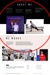
I should do the same on my personal site www.katio.es , i want disable the mobile view of the site on section 1, 2 and 3.
could you help me i'm going crazy.


thanks
 

Attachments

  • Schermata 2020-04-25 alle 13.17.06.png
    Schermata 2020-04-25 alle 13.17.06.png
    184.3 KB · Views: 1

About us

  • Our community has been around for many years and pride ourselves on offering unbiased, critical discussion among people of all different backgrounds. We are working every day to make sure our community is one of the best.

Quick Navigation

User Menu