Review: ViaConnection.com.br

bloomvga

New member
May 12, 2021
12
4
3
Hi guys, good afternoon. I made this site recently using the PORTO theme. Via Connection is a telecommunications company and fiber optic internet provider in the city where I live, Varginha, Brazil (better known as the city of ET).

I hope you like it and I look forward to hearing from you.

Thank you all for the attention.

www.viaconnection.com.br
 

biosonik

New member
Aug 3, 2019
13
22
3
Scotland
Hello Bloomvga

looks good! A couple of things I'd personally check but just my opinion.
  • revslider is overkill - rarely the answer to anything and drags websites down. You can see it pop-in on load.
  • Your mobile page speed is pretty low due to unused css and render blocking. Perfmatters can take care of that in a couple of clicks.
  • Feels a bit soul less without user/company generated content, and the cheap looking stock images detract from the professional look - might be budget constraints though or perhaps it works for your target audience. idk.
  • There's an inconsistency with the branding - seems to be different styles of images throughout. The blue shifts from gradient to flat and there's a vomit yellow/green on the price table but stands out - again, just an opinion.
  • You're probably still mapping out the content for the pages but is a thing so - all the pages pretty much look like copies of each other - there are few or no distinctive changes in the format or information.

Whatsapp as a primary communication channel for an ISP? - that's interesting...

Tbh, I'm certain you'd pick up similar issues on my websites but you did ask :p
 
Last edited:

kaeferliebe

New member
Jun 24, 2022
29
15
3
Germany
Hi bloomvga,

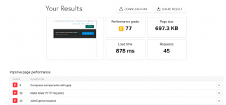
I do like it that someone requested a review for a site that uses a finished theme! The theme itself looks very professional and functional. No problems at all, except that I thought it loads a bit long? So I checked it with pingdom. See the issues you can work on next in the attached screenshot.

I agree with the above review that the images need to be made similar from the color tone or filter. Otherwise it looks like it is not coordinated and off from the CI/CD.

Are you trying to only look for customers in your language? If not, consider integrating more languages.

I think most of your links do not work as they just point at a copy of a sub-page or to nowhere, e.g. social media icon links.

Best wishes,
kaeferliebe
 

Attachments

  • Bildschirmfoto 2022-07-08 um 15.18.25.png
    Bildschirmfoto 2022-07-08 um 15.18.25.png
    72.1 KB · Views: 1

About us

  • Our community has been around for many years and pride ourselves on offering unbiased, critical discussion among people of all different backgrounds. We are working every day to make sure our community is one of the best.

Quick Navigation

User Menu