
Titan
Well-known member
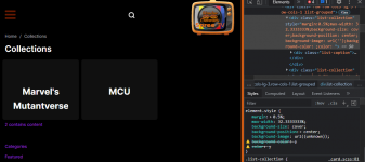
@Shadav This might help you with the tablet size. I remove the logo entirely and did a few re-organization based on Titan latest upload.
@Titan sorry for hijacking your work. Thank you for your tremendous effort. Loads of people are benefiting from this including myself. I am editing it for my own use as well, if all are good I will be migrating existing site to this template. I will be editing quite a lot of it on top of your wonderful work. I don't know if you wanted to collaborate, if you don't mind we can all share same code base through Github and you can push it to the people here.
STEPS:
CSS:@include media-breakpoint-down(md) { .app-navbar { display: none; } .header-search { width: unset; flex: 1; .app-search { width: 100%; margin-left: unset; } } .navbar-nav.navbar-user { flex-direction: row; } }
DO NOT FORGET TO COMPILE YOUR SASS
Results:


to get the scroll to top to display on smaller screen sizes
app/theme/assets/js/app.js
find
change to whatever size you want I went with 200Code:if ($(window).width() > 1000) {
so now the scroll to top shows up on mobile and tabletCode:if ($(window).width() > 200) {
I'll be adding a rendition of these changes to the script in a future update, with some settings to enable and disable them as some people might not want scroll on mobile etc.
As I have done in the past ill put credits to you guys in patch notes.
I have isolated the problem for Country been England, however I can't find a fix if someone wants to take a stab at it DM me and ill explain where the problem is occurring.
")
