graphicfrog
New member
- May 18, 2022
- 0
- 0
- 0
I wish I had the knowledge to fix itNo because thats where I store my videos I don't want people filling my storage up with trash that exists or some unrelated stuff, if you want to use my videos you can do using my APi.
@meyz unfortauntely I still have no idea why this doesn't work, due to it been such a small bug I've put very little time into fixing it, there's nothing stopping you trying to fix it though
you don't want the seasons and episodes section to show at all?
.app-detail .season-list {
  margin: 2rem 0;
  display: flex;
  flex-direction: row;
  max-width: 100%;
  max-height: 600px;
  overflow-y: auto;
  background-color: #101010;
  border-radius: 6px;
}.app-detail .season-list {
margin: 2rem 0;
display: flex;
flex-direction: row;
max-width: 100%;
max-height: 600px;
overflow-y: auto;
background-color: #101010;
border-radius: 6px;
display: none;
}@media (max-width: 767.98px) {
.app-detail .season-list {
background-color: transparent;
flex-direction: column;
}@media (max-width: 767.98px) {
.app-detail .season-list {
background-color: transparent;
flex-direction: column;
display: none;
} // Country
$Country = $this->db->from('countries')->where('language',mb_strtoupper($Listing['original_language'],"UTF-8"))->first();
$CreateYear = ($PostType == 'movie' ? explode('-',$Listing['release_date']) : explode('-',$Listing['first_air_date']));one slight issue I've noticed
when importing from tmdb because it's using the language code EN it imports all movies as country England
so I found that the issue is within
/app/controller/admin/Tmdb.php
but I don't know how to fix itCode:// Country $Country = $this->db->from('countries')->where('language',mb_strtoupper($Listing['original_language'],"UTF-8"))->first(); $CreateYear = ($PostType == 'movie' ? explode('-',$Listing['release_date']) : explode('-',$Listing['first_air_date']));
it's the 'original_language' bit that's messing it up but that's as far as I can get with it
ideas?
original_country or original_name doesn't work
I don't understand the issue your trying to resolve ?
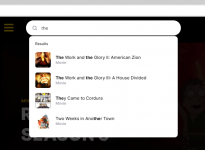
$Country = $this->db->from('countries')->where('language',mb_strtoupper($Listing['original_language'],"UTF-8"))->first();hello, how can i fix search not working properly ?

'Pages'      => 'Pages',
'Hello'      => 'Hello',
'Country'      => 'Country',
'Sorting'      => 'Sorting',
'Comments'      => 'Comments',
'Your password has been sent to your e-mail address !'      => 'Your password has been sent to your e-mail address !',
'Removed'      => 'Removed',
'Code' => 'Code',
'Secret Key' => 'Secret Key',content: '– ';content: ' / ';.breadcrumb .breadcrumb-item + .breadcrumb-item:before {
content: "– ";
color: #9999a5 !important;
}.breadcrumb .breadcrumb-item + .breadcrumb-item:before {
content: " / ";
color: #9999a5 !important;
}<li class="breadcrumb-item"><li class="breadcrumb-item"><a href="<?php echo APP;?>"><?php echo __('Home');?></a></li><li class="breadcrumb-item">.app-slider .slide .slide-caption .imdb {
font-size: 12px;
font-weight: 500;
color: #ffc526 !important;
}.app-slider .slide .slide-caption .imdb {
background: #ffc526;
border-radius: .25rem;
padding: 3px 6px;
margin-right: 20px;
color: #000;
text-shadow: none;
font-size: .9em;
display: inline;
}.app-slider .slide .slide-caption .slide-header > div {
color: rgba(255, 255, 255, 0.6);
margin-right: 10px;
}.app-slider .slide .slide-caption .slide-header > div {
margin-right: 10px;
} .app-slider .carousel-control {
display: none;
}.app-slider .carousel-control {
position: absolute;
top: 50%;
right: 50px;
transform: translateY(-50%);
display: flex;
flex-direction: column;
z-index: 10;
}.app-slider .carousel-control {
position: absolute;
top: 50%;
right: 5px;
transform: translateY(-50%);
display: flex;
flex-direction: column;
z-index: 10;
}.navbar-nav {
display: flex;
flex-direction: column;
padding-left: 0;
margin-bottom: 0;
list-style: none;
}.navbar-nav {
display: flex;
flex-direction: -webkit-inline-box;
padding-left: 0;
margin-bottom: 0;
list-style: none;
}.navbar {
position: relative;
display: flex;
flex-wrap: wrap;
align-items: center;
justify-content: space-between;
padding: 0.5rem 1rem;
}.navbar {
position: relative;
display: flex;
align-items: center;
justify-content: space-between;
padding: 0.5rem 1rem;
}@media (max-width: 991.98px) {
.app .app-wrapper {
display: block;
}
}@media (max-width: 991.98px) {
.app .app-wrapper {
display: inline-flex;
}
}
just to make sure, there were no db changes to this? all just file changes?Hello peoples, another update this one is a lot of rewrites of what I've already done. This is Wovie: Redux 2.0.0 which has both the base version of the website as well as the autoembed version of the website.
if embed link is empty then it automatically gets the link from my API and will automatically embed it
if download link is empty then it automatically gets the link from my API again.
you can mix and match and provide your own embed link for the video and still get my auto download link by leaving the download link empty and vice versa.
Added:
- Manual Embeds
- {if no manual embed} Auto Embed
- Manual Downloads
- {if no manual downloads} Auto Embed Download Link
- Added RSS Feeds
- Movies
- Shows
- Episodes
- Added the ability to toggle RSS Feeds in settings
- Toggle ALL Feeds
- Toggle Movies
- Toggle Shows
- Toggle Episodes
I still can't work out why everything uploaded is from England and I can't work out why some episodes don't have the next button. If I do find the fixes for these, they'll obviously be patched in.
If you want a different API other than mine adding in PM me it'll cost...
Download is attached, if it doesn't work then download it at https://cdn.watcha.movie
Installation Instructions:
- Overwrite all the files apart from /app/config/db.config.php
- Remove install directory
- clear cache on Cloudflare
- done.
just to make sure, there were no db changes to this? all just file changes?
If you view the site at around 850px to 980px or soCorrect no database changes, there's a database string change, but that changes when you toggle the setting not a manual database change.
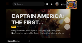
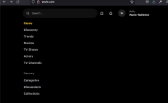
In the changes you've made what was the problem with the logo ? why is it over on the right now ?
If you view the site at around 850px to 980px or so
the logo replaces the menu hamburger
the problem is that it doesn't actually work
if you click the logo (which is now the menu drop down icon instead of the hamburger)
it shows the menu for a split second (depending on fast your site loads) and then kicks you to the homepage instead of being the menu
I tend to work on my computer with split screens and so my screen is usually around 955px or so
at this screen size a few things get wonky (as mentioned above)
the main issue is that the menu doesn't work, the logo replaces the hamburger menu but if you click on it, it redirects you to the homepage
the only way I could "fix" this was to just remove the logo from the menu code and then I threw it over to the right so that the logo was still there but not messing up the menu.
.app-detail .season-list {
margin: 2rem 0;
display: flex;
flex-direction: row;
max-width: 100%;
max-height: 600px;
overflow-y: auto;
background-color: #101010;
border-radius: 6px;}.app-detail .season-list {
margin: 2rem 0;
display: flex;
flex-direction: row;
overflow-wrap: anywhere;
max-width: 100%;
max-height: 600px;
overflow-y: auto;
background-color: #101010;
border-radius: 6px;}.app-detail .season-list .seasons .nav a {
padding: 15px 20px !important;
display: block;
text-align: center;}.app-detail .season-list .seasons .nav a {
padding: 15px 20px !important;
display: table-footer-group;
text-align: center;}.app-detail .season-list .seasons .nav {
flex-wrap: nowrap;
overflow-x: auto;}.app-detail .season-list .seasons .nav {
flex-wrap: nowrap;
overflow-x: auto;
padding: 15px 20px;}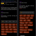
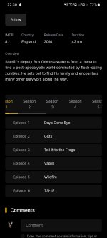
another slight issue...if a series has a lot of seasons
it runs off the width of the page
app/theme/assets/app.css
find
change toCode:.app-detail .season-list { margin: 2rem 0; display: flex; flex-direction: row; max-width: 100%; max-height: 600px; overflow-y: auto; background-color: #101010; border-radius: 6px;}
Code:.app-detail .season-list { margin: 2rem 0; display: flex; flex-direction: row; overflow-wrap: anywhere; max-width: 100%; max-height: 600px; overflow-y: auto; background-color: #101010; border-radius: 6px;}
find
change toCode:.app-detail .season-list .seasons .nav a { padding: 15px 20px !important; display: block; text-align: center;}
Code:.app-detail .season-list .seasons .nav a { padding: 15px 20px !important; display: table-footer-group; text-align: center;}
find
change toCode:.app-detail .season-list .seasons .nav { flex-wrap: nowrap; overflow-x: auto;}
Code:.app-detail .season-list .seasons .nav { flex-wrap: nowrap; overflow-x: auto; padding: 15px 20px;}
though I'm not sure how well this will hold up to something that has a lot more seasons

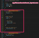
@include media-breakpoint-down(md) {
  .app-navbar {
    display: none;
  }
  .header-search {
    width: unset;
    flex: 1;
    .app-search {
      width: 100%;
      margin-left: unset;
    }
  }
  .navbar-nav.navbar-user {
    flex-direction: row;
  }
}
if ($(window).width() > 1000) { if ($(window).width() > 200) {
